VISUALIZING IDEAS

Environmental Signage
Large-scale infographics designed to position our firm’s brokers as thought leaders. Strategized with our amazing Research group (which created the content) on direction. Created to be scalable in all formats - as signage, reformatted for social media (Twitter, LinkedIn, Facebook), and in a wide variety of print media including presentations and brochures.
Brand Articulation
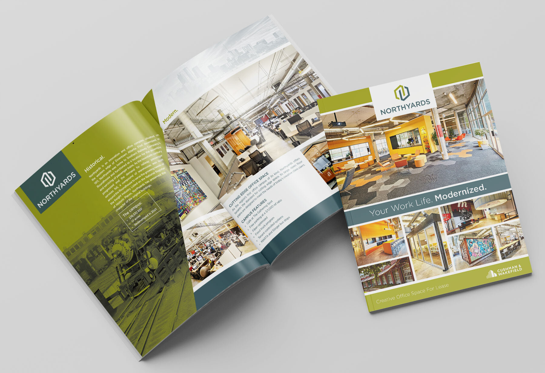
Award-winning brochure I designed and created for an exciting adaptive reuse project. We needed an engaging new brand for the project, connecting to millennials with creative imagery and collaborate workspaces. I retained the authenticity of the space with imagery of its former life as a railroad depot.

Envisioning The Future
To lease empty office space at one of our projects, I needed to help clients see future benefits not readily apparent. I designed a series of window decals including this one, affixed to windows around the space to convey the access to future employees and clients if they leased the space. It worked!
Culture Power
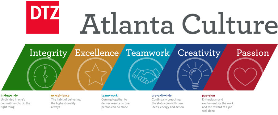
An organization’s culture can make or break it. To convey what can be an amorphous concept - especially to new employees - I was asked to create large signage for the main meeting room. Layering and angularity give the piece energy, helping to galvanize and unify employees - and sending a positive message to visitors.
Telling A Story
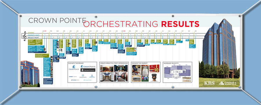
One infographic can say a lot. This was the main deliverable used to convey to a client the benefits we’ll deliver - an orchestrated list of strategy and tactics - with a witty presentation piece I created nodding to a shared love of music.
Can Virtual Be Real?
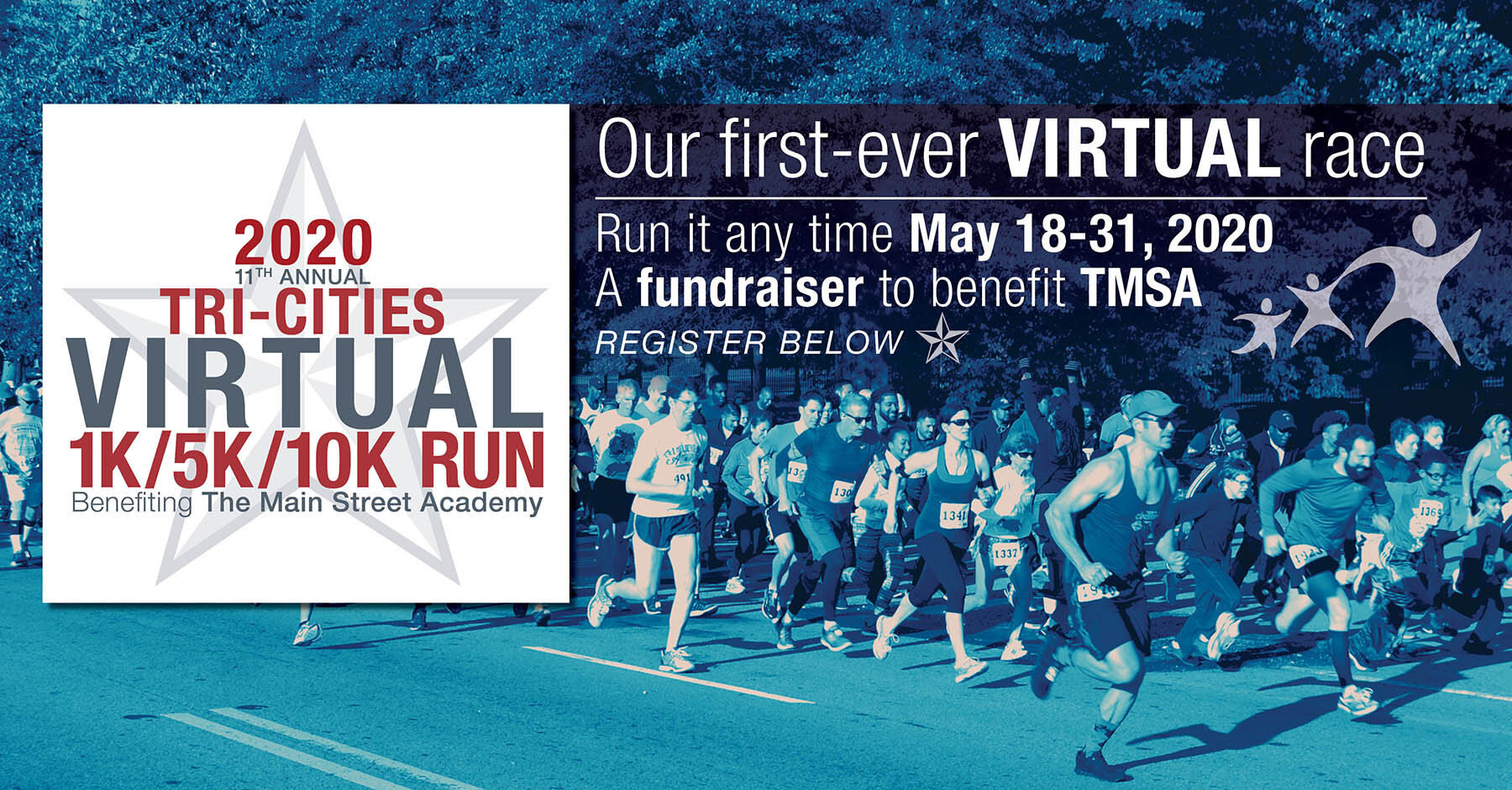
The 2020 pandemic presented us all with challenges to normalcy. The Main Street Academy was determined to continue our longest-running fundraiser and community event - the Tri-Cities Run Walk - as a virtual event in 2020. I performed a rebrand, including a new logo and imagery, that helped retain the equity built in 10 prior years (for which I also did most of the marketing) and create our first virtual fundraiser - a success.

Thought Leadership
For our first-ever Atlanta healthcare / medical office survey, I wanted a design with clarity and pop, to convey a lot of information easily. Our brokers used it to show clients their command of market knowledge, leading to new business wins.
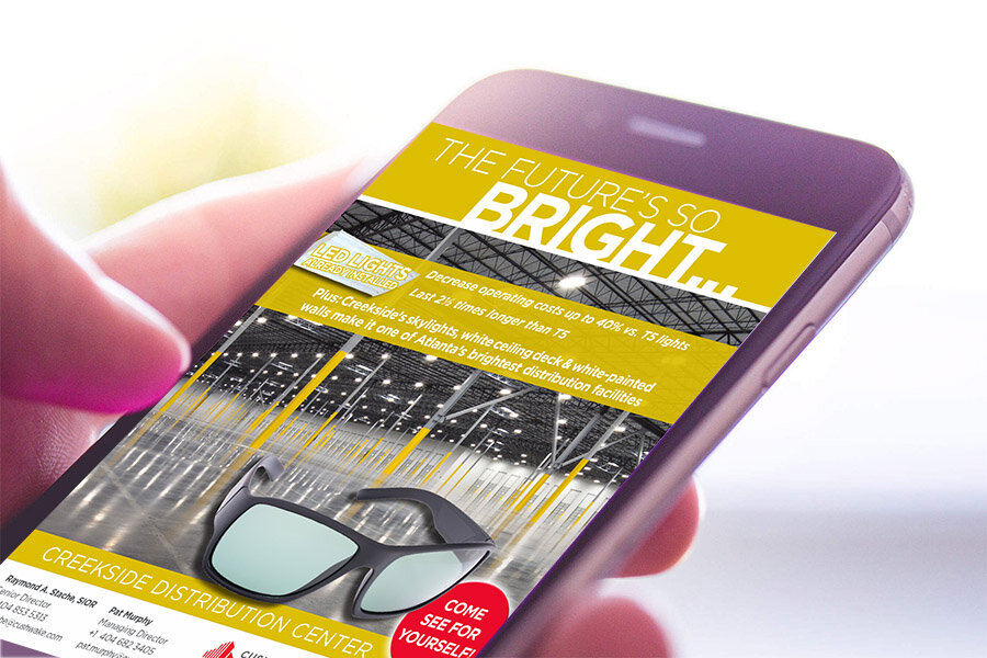
On The Go
A lot of my recent work has been used to reach audiences on the go, from social media to email campaigns like this. For this one, I injected energy and wit into what can sometimes be seen as a commodity (warehouse space), playing off the one bit of color in the photo and drawing the viewer in with fun and positivity. The client loved it, and it helped us close deals.
